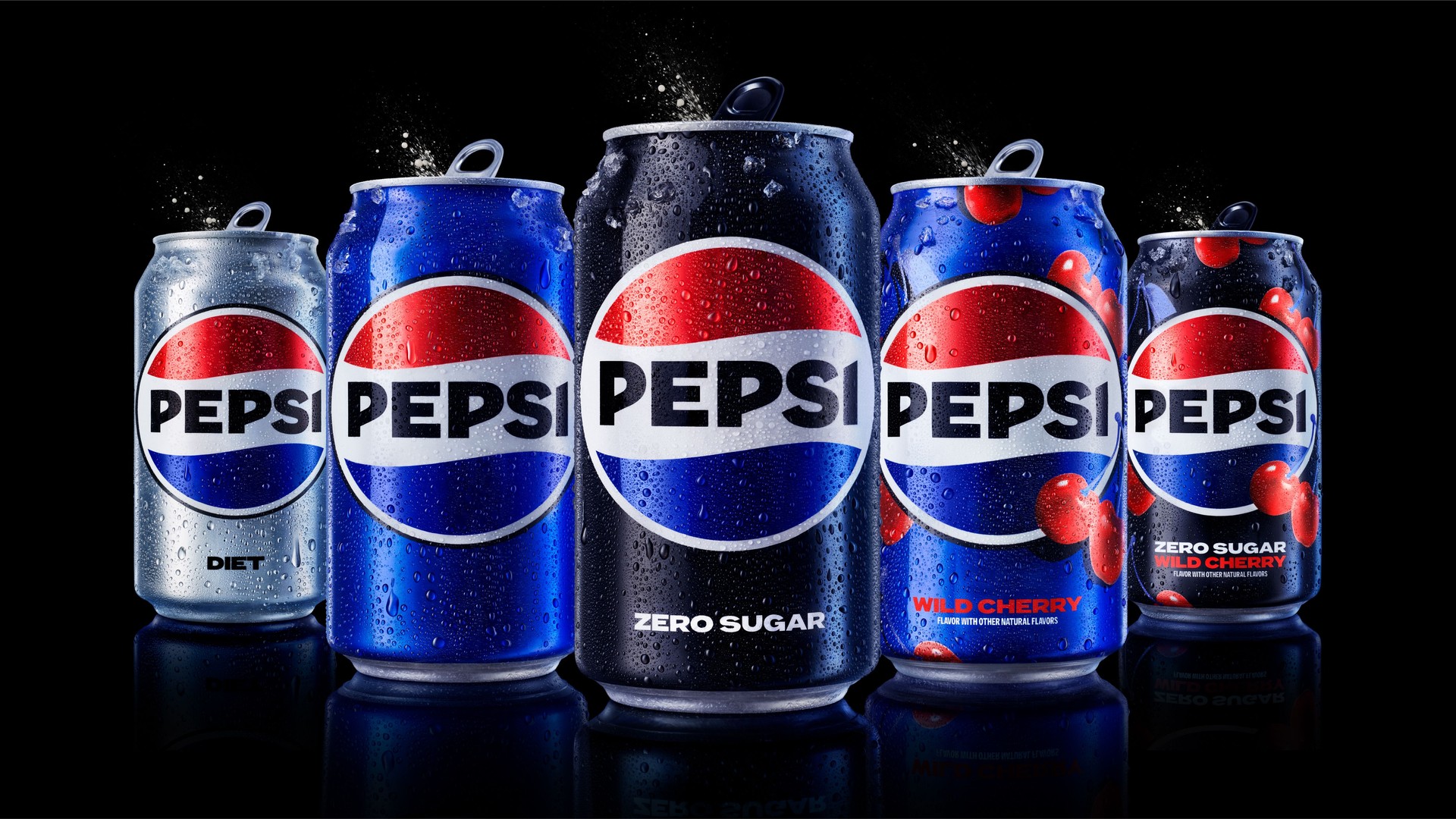
PepsiCo, one of the world’s leading beverage companies, has recently unveiled Pepsi new logo and visual identity system for its flagship brand. This significant change comes as the brand prepares to celebrate its upcoming 125th anniversary and looks to the future. The new look is set to hit shelves in 2024 and is the first major update the brand has undergone in 15 years.
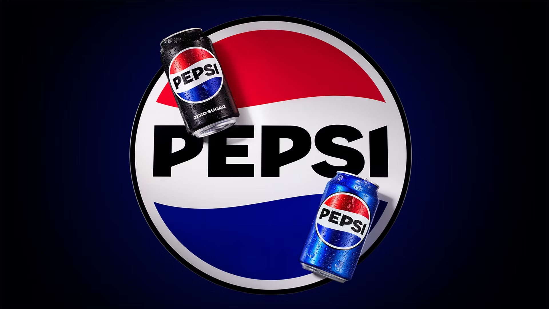
The Pepsi new logo design incorporates the brand’s name into the iconic red, white, and blue globe, a design that first hit its stride in 1987, only to be scrapped in 1997. The new and improved Pepsi wordmark, now bigger and more striking, feels more natural nestled inside the sphere, rather than standing next to it.

Other changes to the visual identity include an update to the color palette and typography. The soft and rounded lowercase “Pepsi” has been replaced by a more dynamic and energetic wordmark in all caps. The brand’s new typography also features a rounder look, with a more vibrant color palette that includes a new black and electric blue.
Where will we see Pepsi new logo?
Pepsi’s new brand identity is set to be seen across all physical and digital touchpoints and will represent the brand’s unapologetic and enjoyable qualities. The brand cites its ties to pop culture and its “bold challenger mindset” as inspiration for the makeover.
The Pepsi Challenge promotion, its influence on the Superbowl Halftime show, and iconic advertisements featuring superstar actors and musicians are all examples of the brand’s contribution to pop culture over the years.
Mauro Porcini, SVP & chief design officer of PepsiCo said these about the Pepsi new logo in a LinkedIn post:
“We designed this new brand identity to be unapologetically current and undeniably Pepsi,” said ”
”The Pepsi wordmark and globe blend together to take over every touchpoint, from packaging to equipment to fashion”.
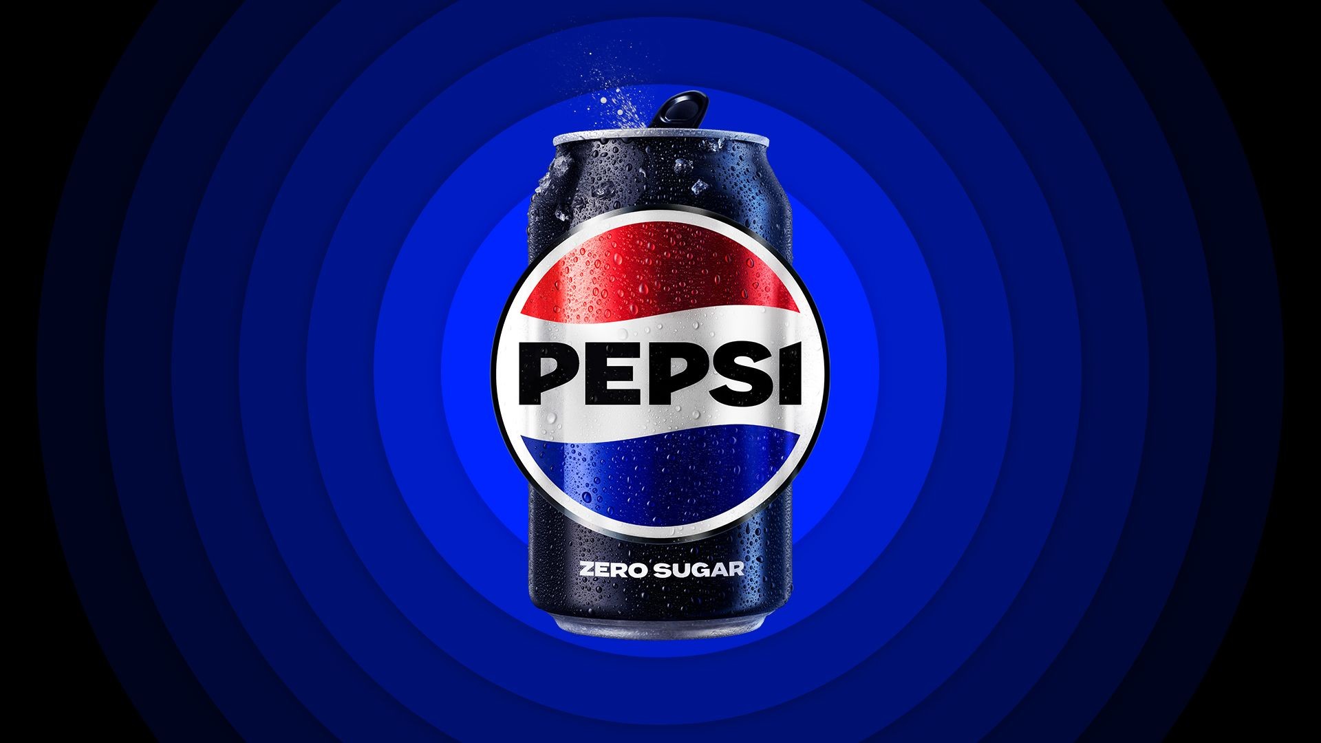
”Black – that same black in our Pepsi Zero Sugar identity – paints the wordmark, outlines the globe, and, blending into blue, radiates into the world with a new, ownable pulse. The Pepsi pulse. The pulse that connects the digital and physical dimensions of Pepsi”.
– Mauro Porcini on Pepsi new logo
Pepsi’s new update follows the recent global refresh of its lemon-lime soda brand, 7UP, which PepsiCo distributes outside the United States.
The brand’s new visual identity aims to be unapologetically current and boldly Pepsi, reflecting the company’s forward-thinking attitude towards the future.
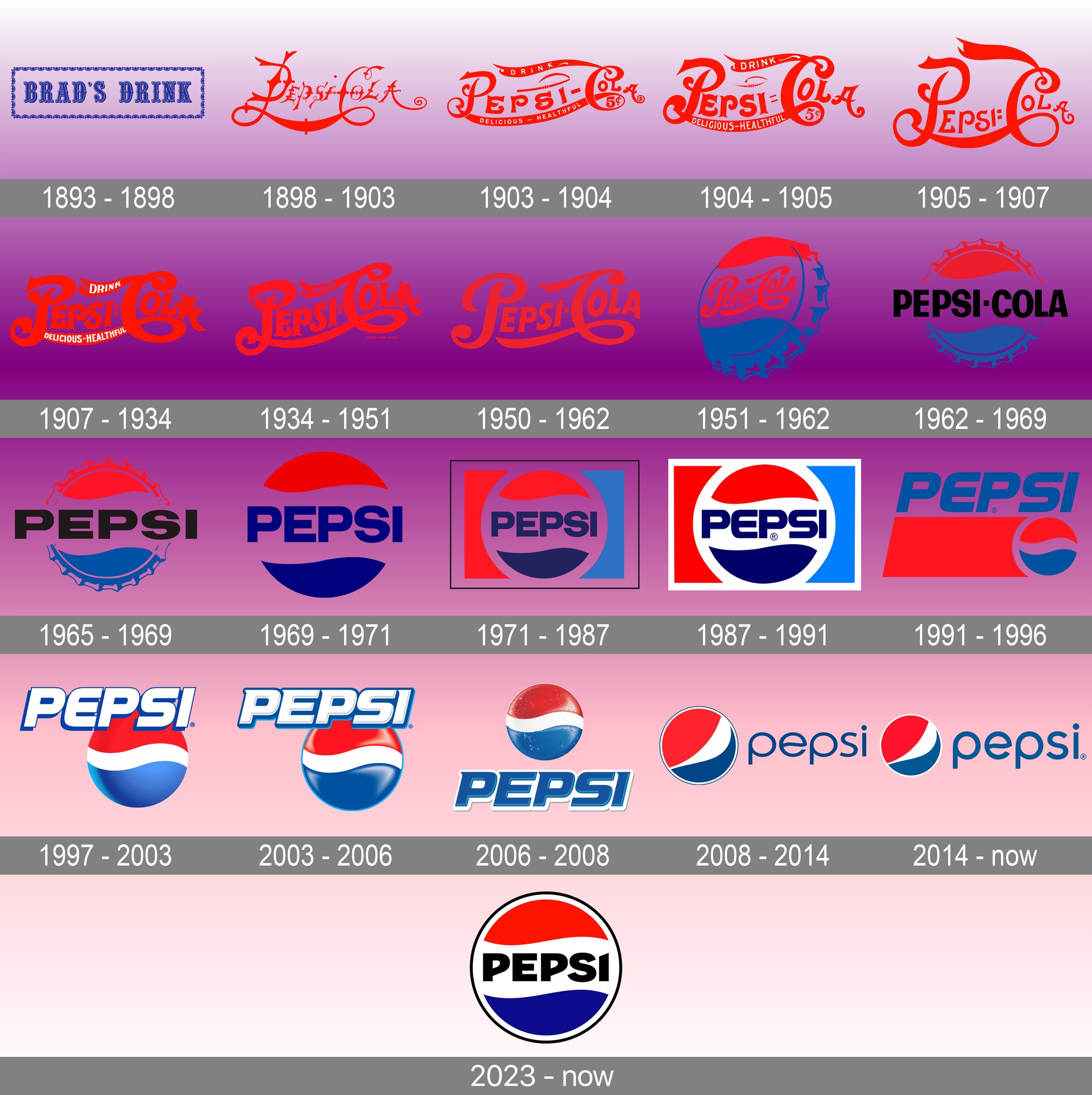
This is not the first time we see a Pepsi new logo
PepsiCo, one of the world’s leading beverage companies, has had several logos throughout its history, each representing a different era in the brand’s evolution.
The earliest Pepsi logo dates back to 1898 when the brand was first introduced as “Brad’s Drink.” This logo featured a red script against a blue background and emphasized the brand’s digestive benefits.

In 1903, the brand was renamed “Pepsi-Cola,” and the logo was updated to feature a more modern-looking script, with a red and white color scheme. This logo remained in use for several decades until 1940, when the brand introduced a new logo featuring a bottle cap with the brand name inside.
In 1950, the brand updated its logo again, this time featuring a more streamlined bottle cap design with a red, white, and blue color scheme. This logo remained in use until 1962 when the brand introduced a new logo featuring a stylized red, white, and blue wave, which was meant to represent the refreshing taste of Pepsi-Cola.
In 1973, the brand introduced a new logo featuring a bold, italicized typeface with a red, white, and blue color scheme. This logo remained in use until 1987 when the brand introduced its iconic globe logo, which incorporated the brand’s name into a red, white, and blue globe. This logo was updated in 1991, with a more modern-looking script and brighter colors.

In 2003, the brand introduced a new logo featuring a stylized wave and a more modern-looking font. This logo remained in use until 2008 when the brand introduced its current logo featuring a more minimalist design with a simple, lowercase font and a new color scheme.
And now with the 2023 Pepsi new logo take, the brand is getting ready to bring whole new experiences to lovers of Pepsi. Maybe that’s why they even re-released Peeps Pepsi earlier this year.

